GEEK WINDOW CLEANING
GEEK WINDOW CLEANING
Brand Re-Vamp:
Geek Window Cleaning
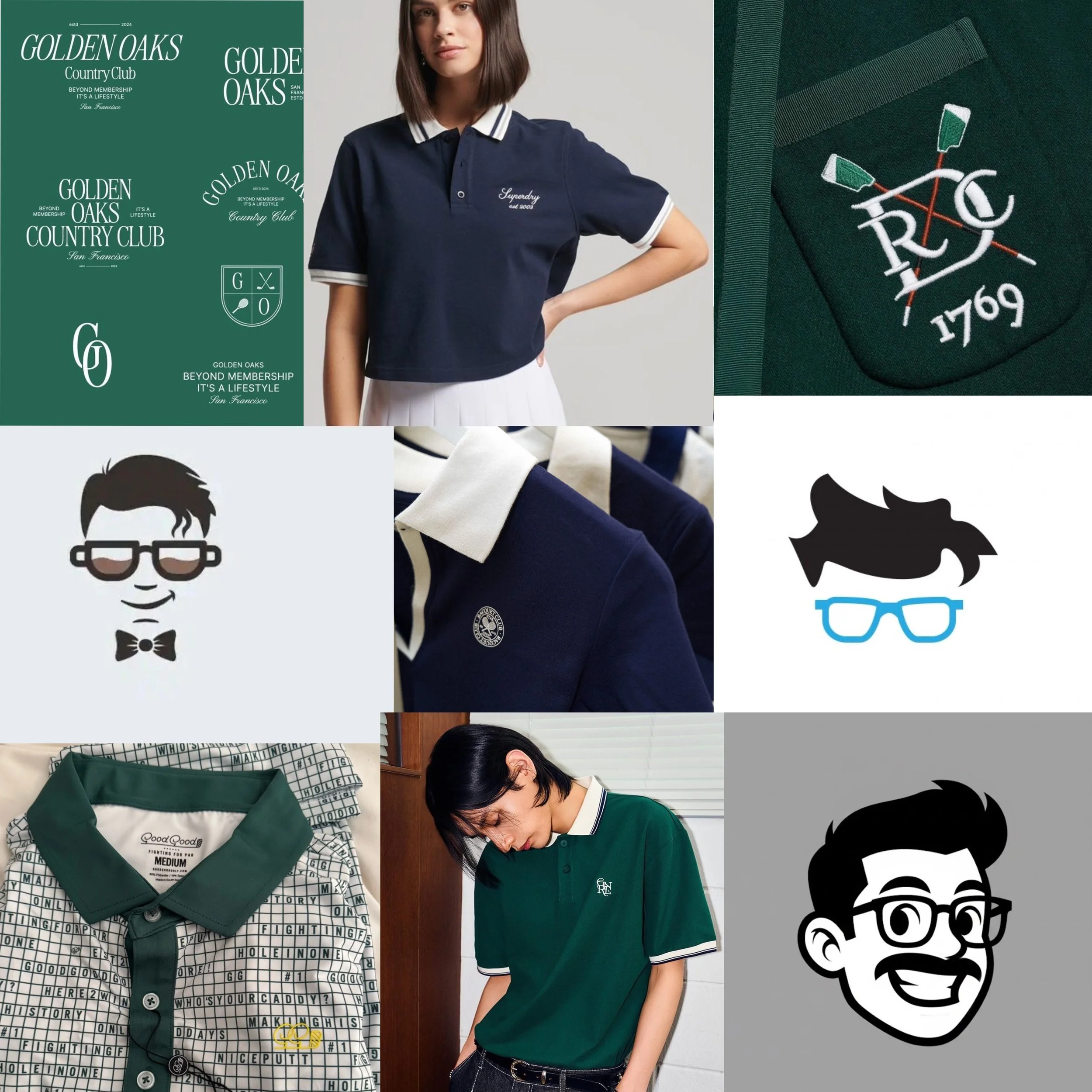
Style Inspiration
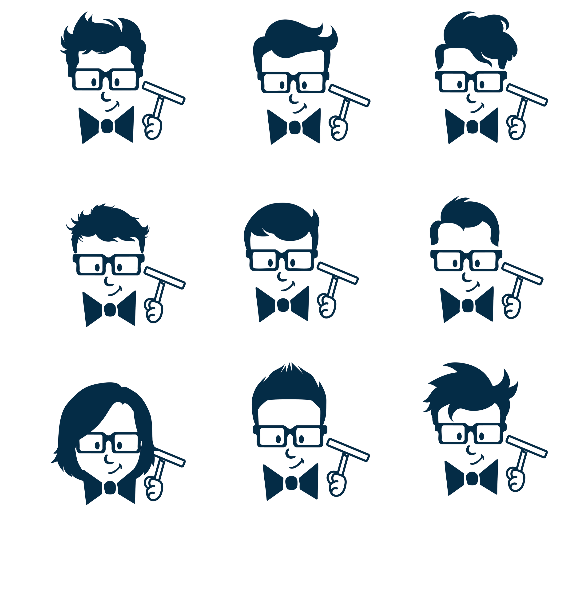
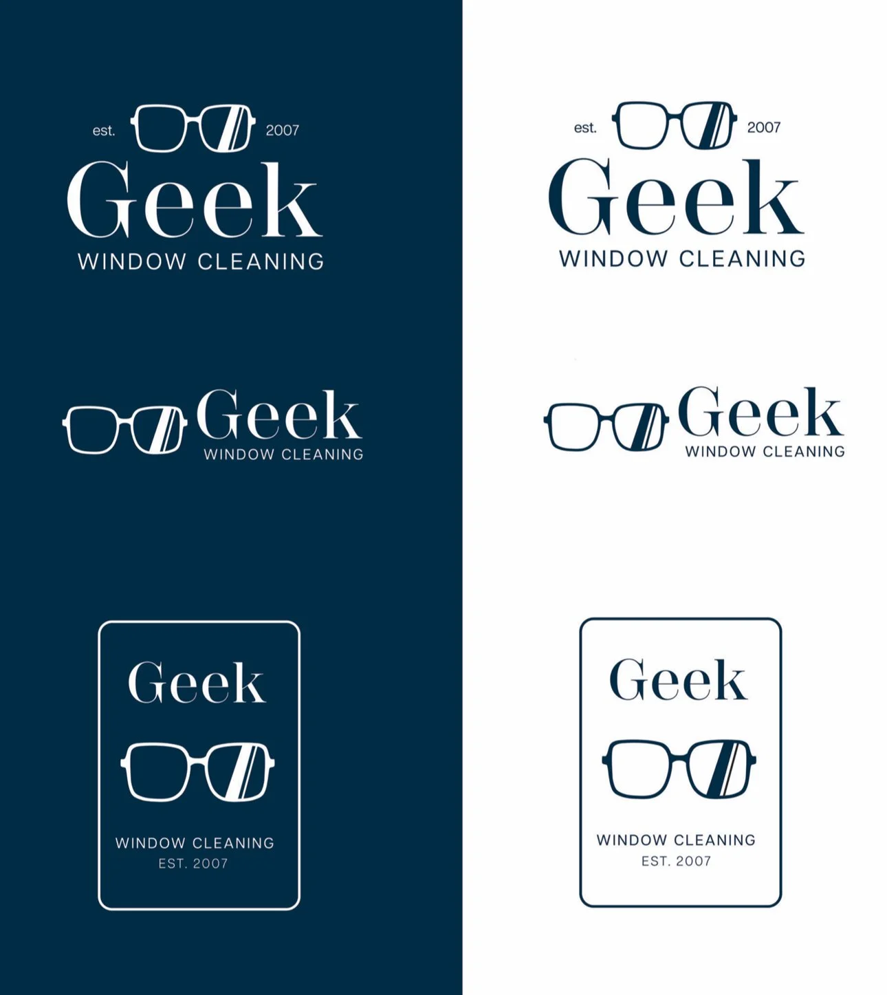
Draft #1
For the first draft, I tried to explore things that felt modern and playful. The client said while he had a general direction, he wanted to see different things and explore options without his mascot.
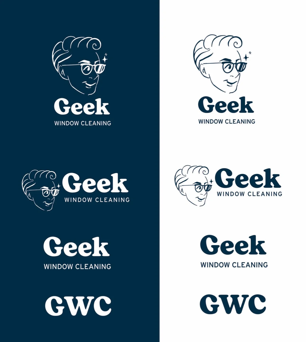
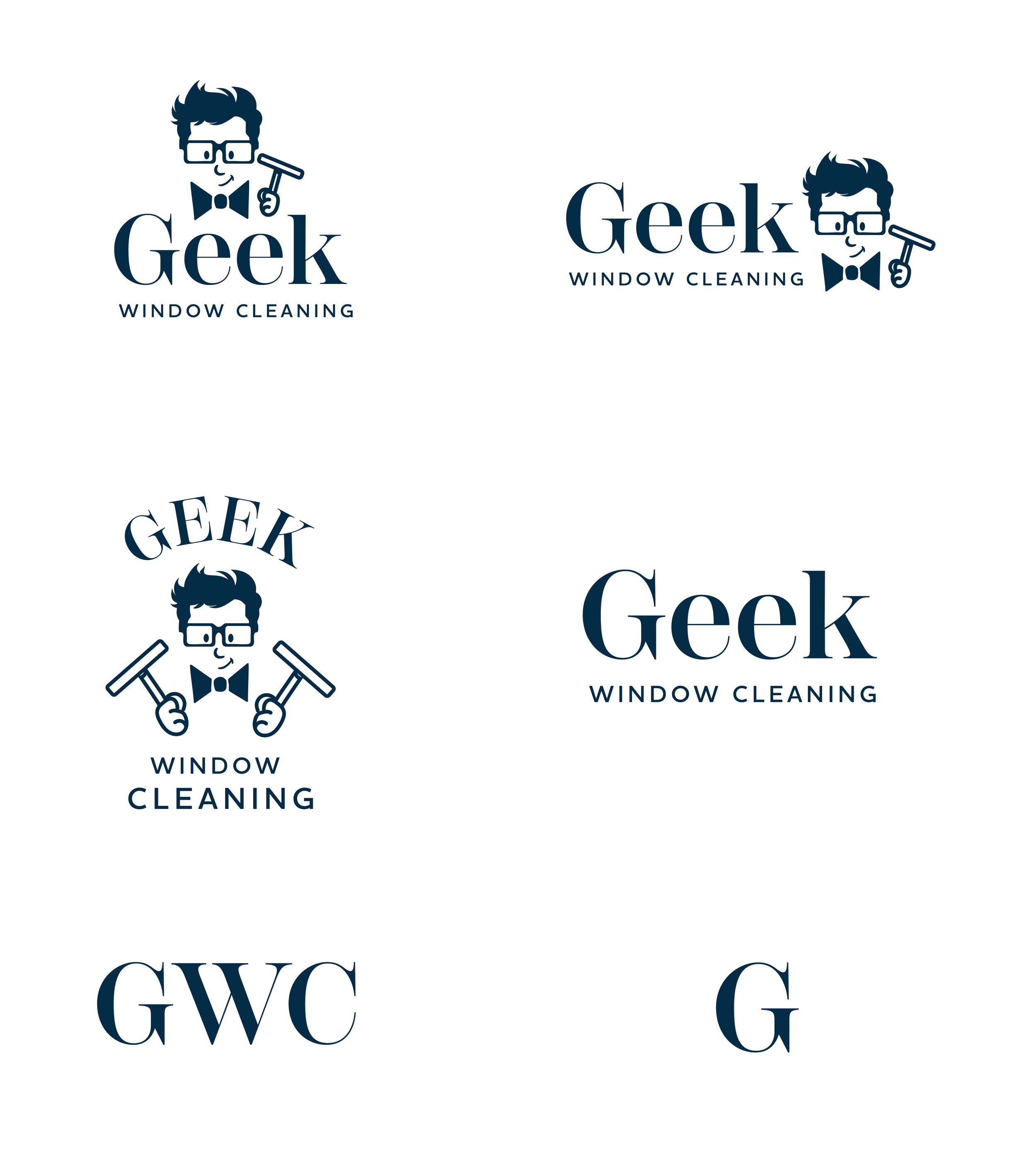
Draft #2
After discussing the initial designs with the client, we were able to decide what was working and what wasn’t hitting the mark. While the client enjoyed the clean look of serif typography, he felt that he did want to keep his mascon, and that the first draft felt like it was a bit too different from the original. It became clear to me that the mascot meant a lot to the client, so I went back to the drawing board to illustrate an option that felt new, but familiar.
The Project
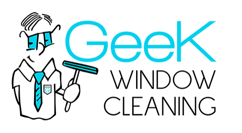
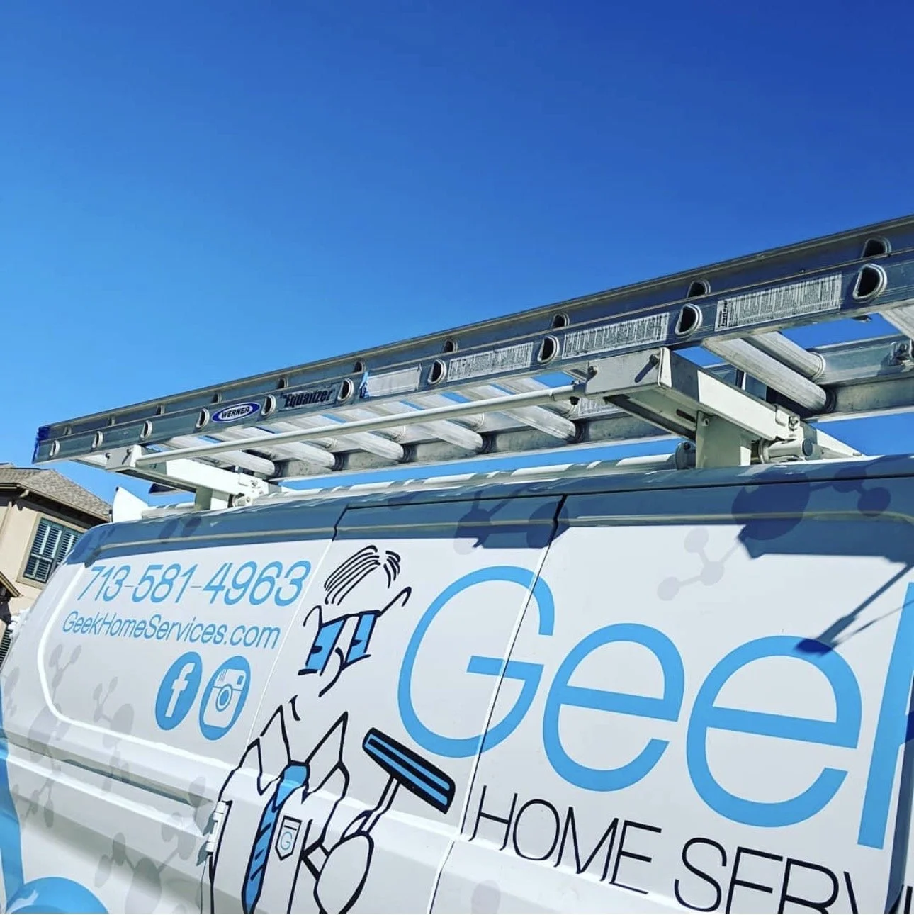
For this project I was asked to re-design and revamp a logo. Geek window cleaning is an established window cleaning service that is known for their great work and friendlyness. Since it’s been around since 2007 ,the look of the brand has been very important in getting them the clientele they have today.
The client expressed that even though he loves his brand, he feels like its become outdated and feels that as he has been breaking into the luxury home market, he wants a look that will help reach new clients, while sating true to the original intention .
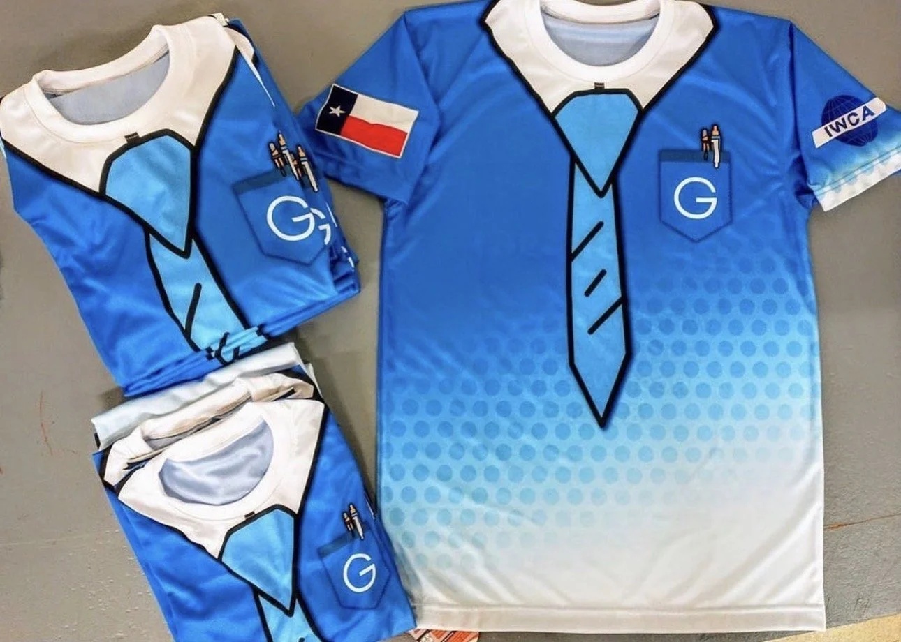
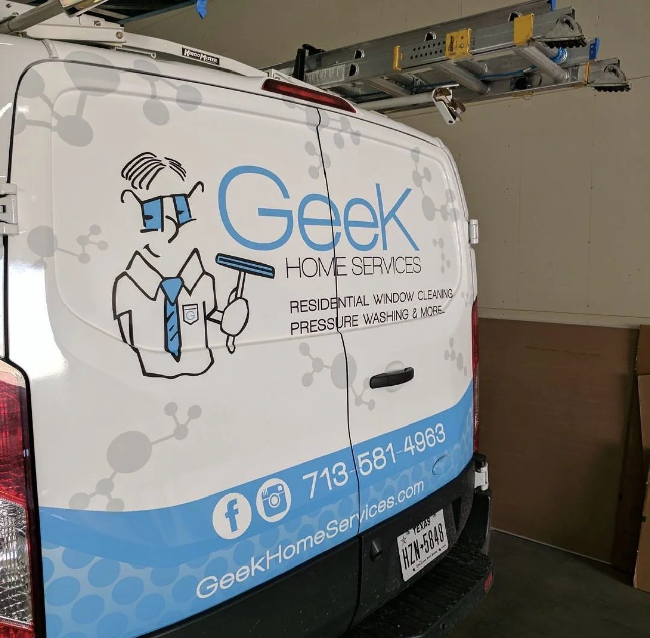
Original Logo & Branding
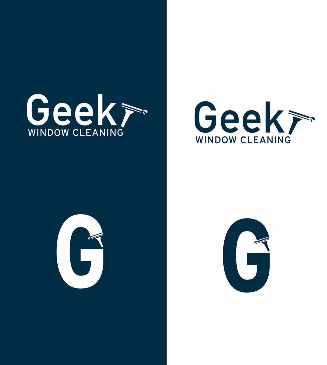
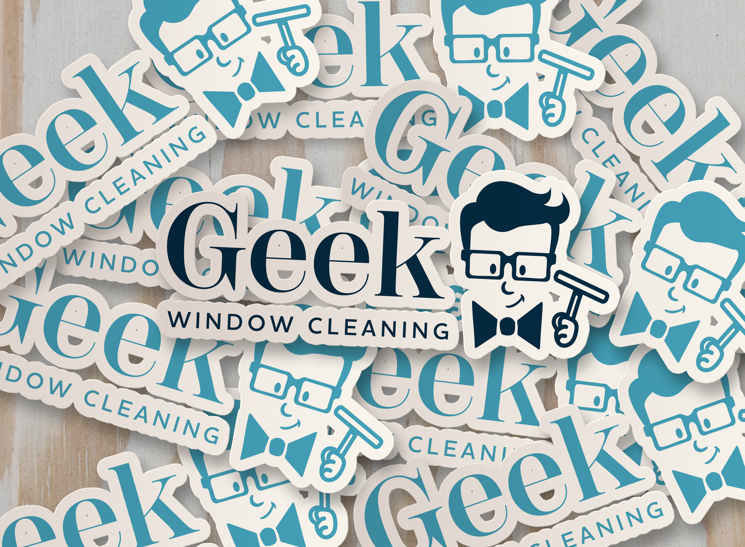
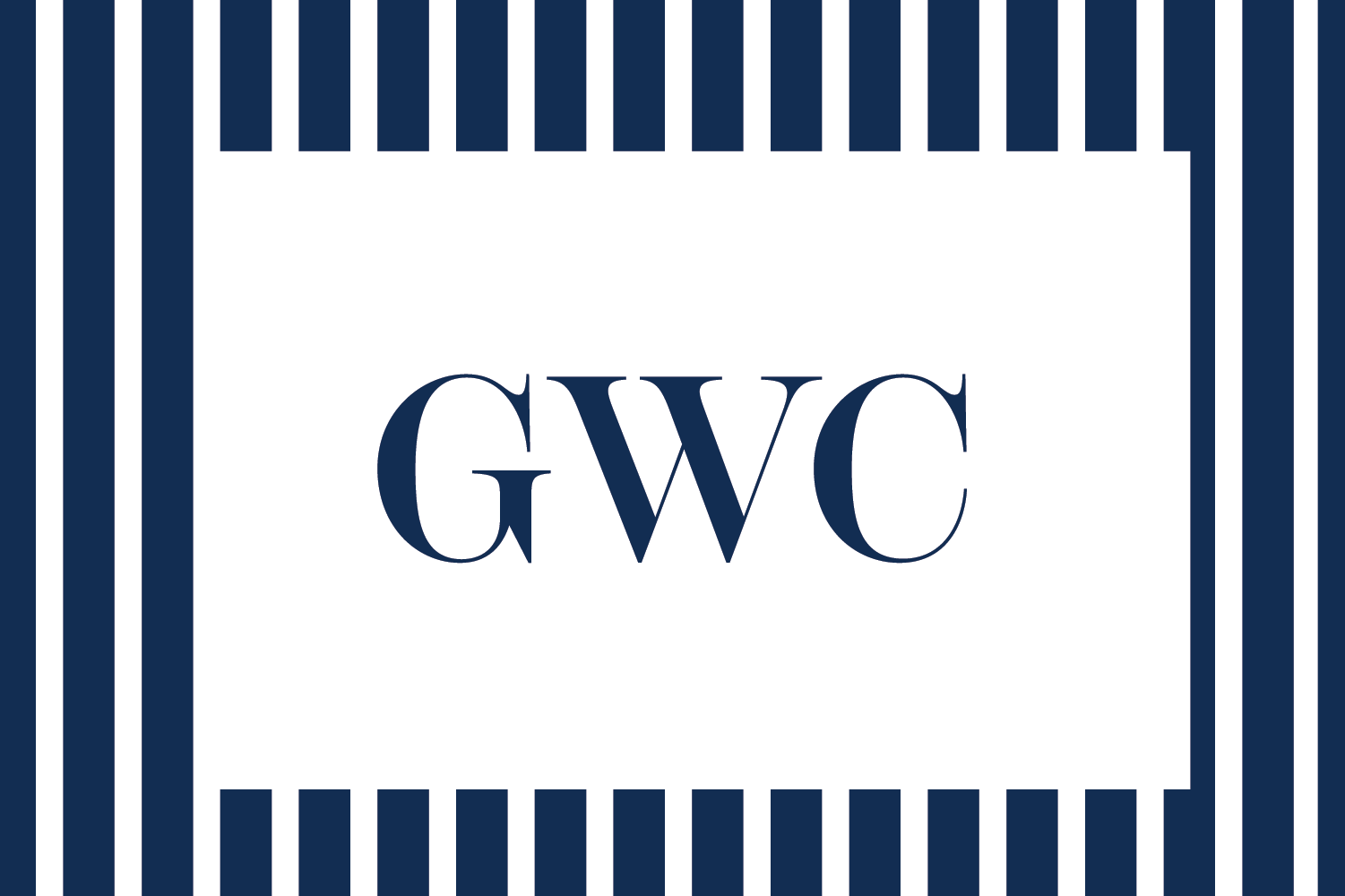
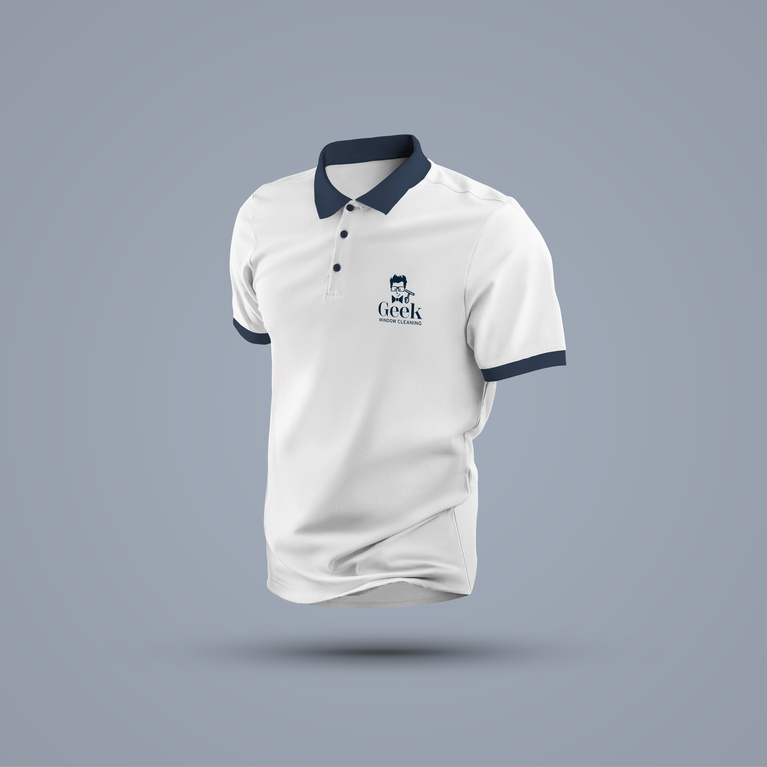
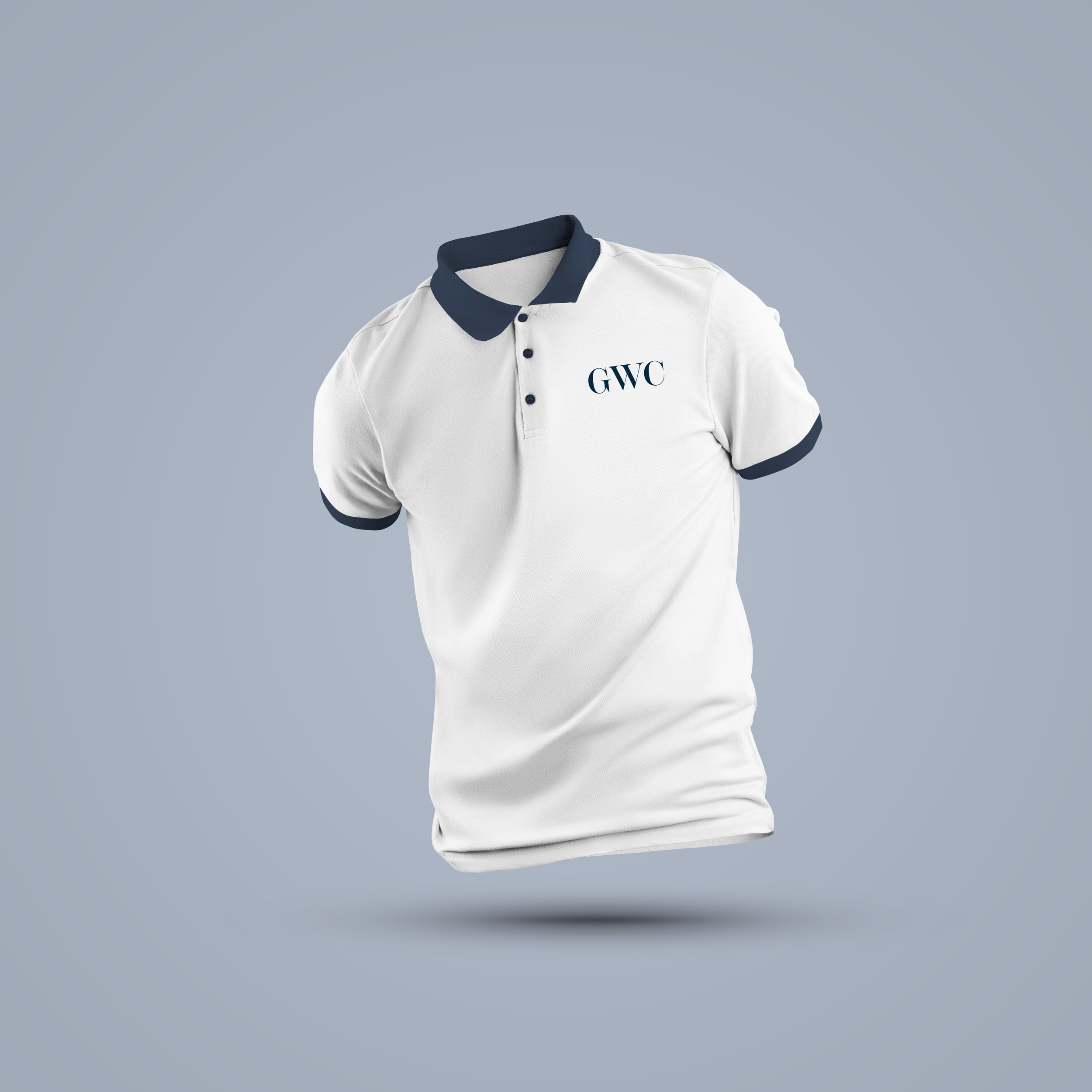
I made logo variations that would give my client the option to use a simpler version of the logo when needed.
The client came into the project with a clear sense of the design styles that appealed to him. He was drawn to a clean, preppy look that felt timeless, while also enjoying more illustrative, cartoonish styles that felt fun and playful. He emphasized that the brand reflects him: fun, goofy, and not overly serious. I to think of how I could explore ways to combine that sense of playfulness with a modern aesthetic.
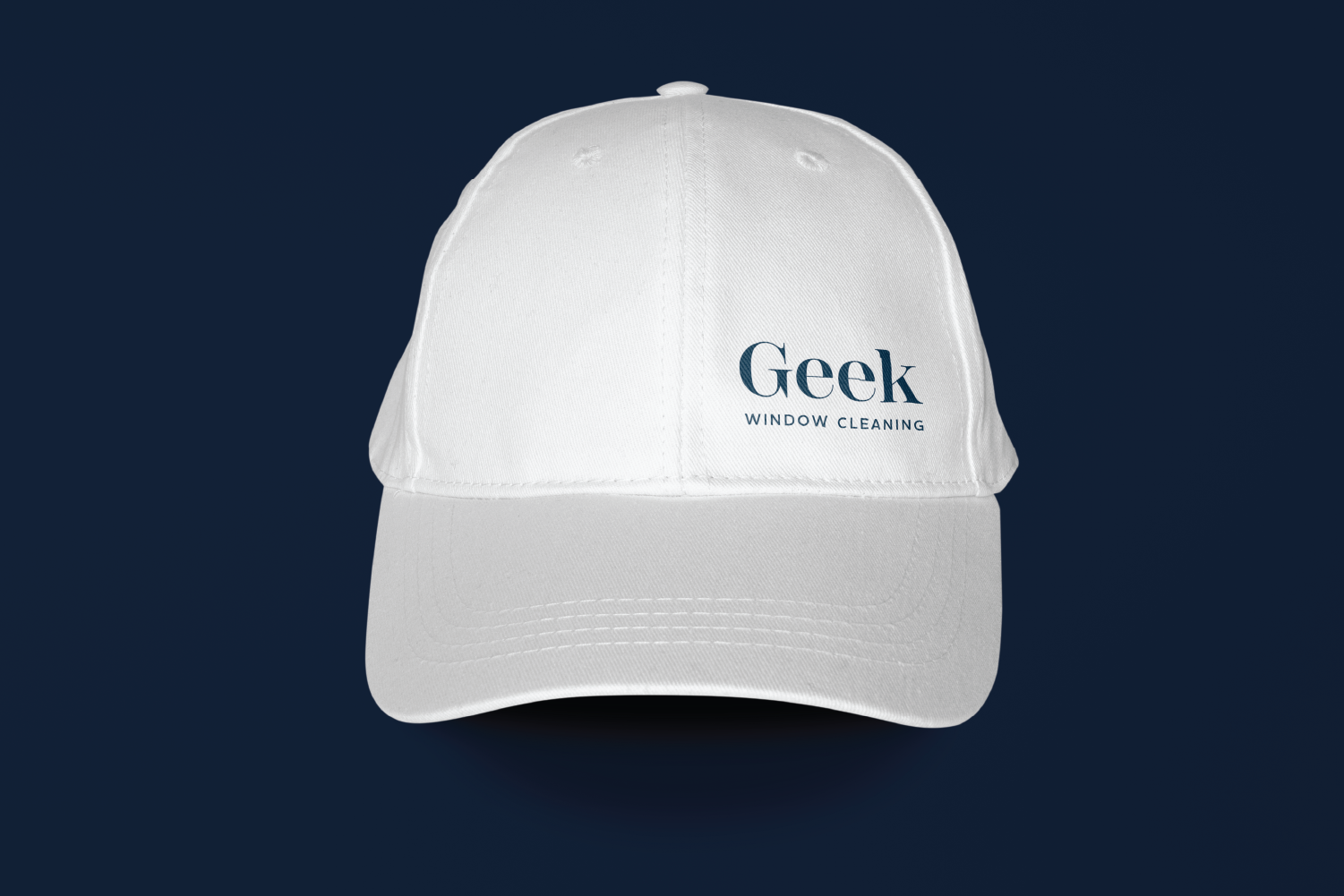
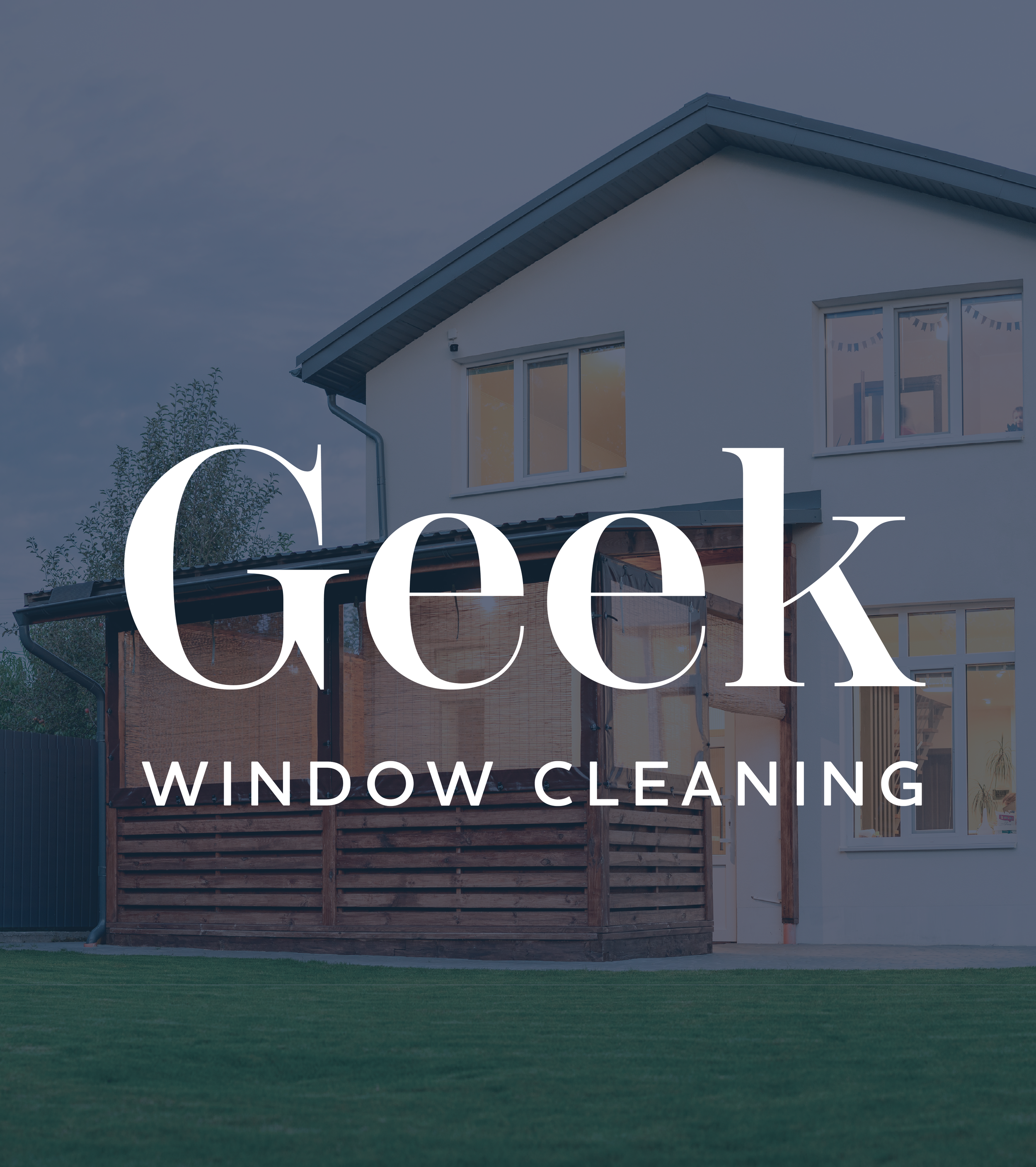
Final Deliverables